Chronosphere - Info Model
End-to-End UX Design

Description: Chronosphere is a scalable, reliable, and customizable monitoring solution built for cloud-native applications. The product is built on top of M3, a scale metrics engine developed at Uber.
I joined the Chronosphere team right after its series B funding as the second UX designer. I led the first product redesign and transformed the product’s organization to mirror the team environments of our customers.
My Role: Lead UX Designer
The Team: 1 Product Manager, 1 Engineering Manager, 8 Engineers
My Responsibilities: When I joined Chronosphere, I was one of only two designers supporting a rapidly growing company. This project challenged me to move beyond feature design and into systems thinking, user research, information architecture, and cross-functional leadership. Through this work, I helped the organization scale from a product designed for small teams to one that could support enterprise customers.
Tools: Figma, Miro
Company Overview
Chronosphere is a digital monitoring company for the cloud-native world that was founded in 2019. The company founders recognized that today’s monitoring tools are not equipped to handle the complex and dynamic nature of cloud-native environments. Open source tools help get companies started but they do not scale effectively to fit the customer’s needs. Chronosphere delivers scalable, reliable and customizable monitoring for companies adopting cloud-native.
Chronosphere not only allows customers to store and retrieve massive amounts of data but also does so in a cost efficient manner. Chronosphere lets customers understand and control their spending, even as the data continues to grow. This level of visibility and control is the first of its kind and can help reduce monitoring costs by up to 10 times.
Chronosphere is provided as a hosted service which eliminates the need to manage a monitoring infrastructure while still maintaining compatibility with cloud-native standards like Prometheus, PromQL and Grafana Dashboards.

Design Challenge
As Chronosphere's customer base expanded from smaller organizations to large enterprises, a critical usability challenge emerged. The product had been designed around complete visibility - every user could see every dashboard, monitor, and service across their organization. While this worked well for smaller teams, it created significant friction as customers scaled.
Through user research and workflow analysis, I discovered that users were spending valuable time searching for the information they needed. Engineers responsible for a small subset of services were forced to navigate through thousands of unrelated entities, making it difficult to quickly identify ownership, understand context, and respond to incidents.
This friction affected some of the most important workflows in the product. Users struggled to find relevant data, understand how resources related to one another, and efficiently triage issues when incidents occurred.
We hypothesized that organizing the product around team ownership and relevance—rather than exposing the entire system equally to every user—would improve discoverability, reduce cognitive load, and help users complete critical tasks more efficiently.
To validate this hypothesis, we set out to design a model that would:
Personalize the experience so users could quickly access the services and data most relevant to them
Provide clear ownership and contextual relationships between dashboards, monitors, and services
Reduce the time required to investigate and resolve incidents
Create a scalable foundation that could support increasingly complex enterprise environments
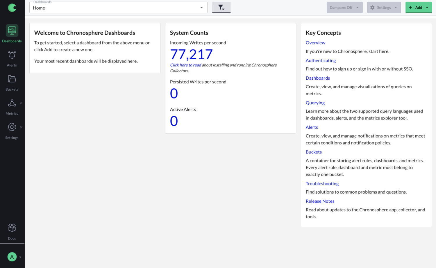
In the previous design, all users would log into Chronosphere and see the same dashboard. This dashboard displayed general documentation and overall system data. Nothing was specific to the user, therefore nothing was relevant. To see a more specific dashboard, the user would have to use the dropdown at the top of the page. For larger customers, this dropdown could contain hundreds of dashboard names making the scroll process rather tedious.
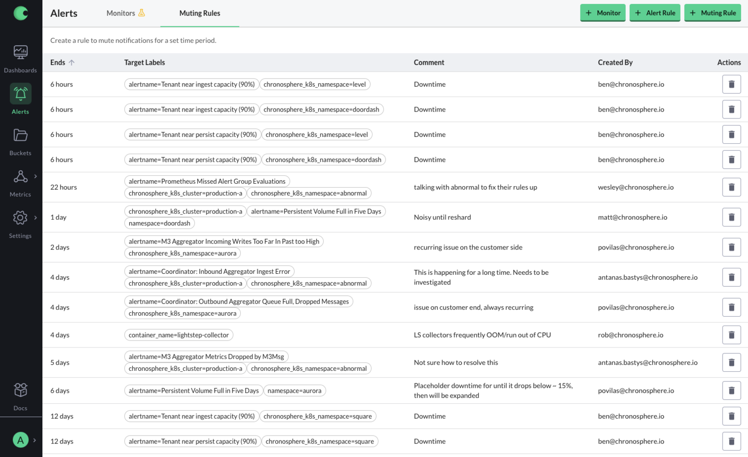
This image shows the previous design of the alerts page. The user could see every alert in the system and there wasn’t a way to search through it. If the user needed to change or delete an alert, they would have to navigate through all of them to find the one that the needed. This was not only time-consuming process but also one with many errors. The user could easily delete another team’s alert. Other pages in the product had similar functionality in which the user could accidentally mess with another team’s information.
Process
Success Metrics
Before exploring solutions, we aligned on what success would look like for this initiative. Because the information model directly impacted core workflows like discovery and incident response, we defined metrics that reflected both efficiency and user confidence. These metrics became the foundation for design decisions throughout the project, allowing us to evaluate ideas based on their impact on user workflows rather than purely structural or visual improvements.
Time to locate a service or dashboard
Time spent triaging an issue
Discoverability of owned and relevant resources
Reduction in navigation steps required to complete key workflows
User confidence during transition (avoiding perceived “lost data” during migration)
As the lead designer on this project, I had full control over the design process. I thought it was important to start with a full research deep dive so I could understand the landscape and the need for the major design upgrade.
Once I had a strong understanding, I created user flows and personas which were verified by the project’s PM. I then collaborated with the UI engineers to create designs that were easy to understand yet fit our strict timeline.
Since the project affected almost every part of the Chronosphere, I received a lot of feedback from executive leadership and engineers on other teams.

Personas
Understanding user motivations was critical to identifying where friction existed in the experience and which opportunities would have the greatest impact.
When I began this project, Chronosphere's personas were organized primarily around job titles. While useful for understanding organizational structure, I found that job titles alone did not accurately predict how users interacted with the product. Users with different titles often shared similar goals, workflows, and pain points, while users with the same title frequently had very different needs.
Through user interviews and research, we evolved our personas to focus on user goals and behaviors rather than roles alone. This shift helped us better understand why users came to the product, what they were trying to accomplish, and where they encountered obstacles along the way.
By grounding design decisions in user motivations instead of organizational hierarchy, we were able to identify higher-impact opportunities, prioritize the most important workflows, and create an experience that better supported users as their organizations scaled.
Service Expert
Service experts have a strong understanding of the company’s infrastructure and are often utilized when problems arise that require deep expertise. Sharing information can be challenging. Info model allows service experts to organize information by service and share some of their understanding with other users.
On-Call Engineer
When an engineer is on-call and receives an alert, they need to respond to and solve the issue as quickly as possible. Having all the relevant monitors and dashboards in a single space allows engineers to quickly find, diagnose, and triage the issue.
Assumptions
Before exploring solutions, I partnered with the product manager and engineering team to identify the assumptions driving the project. These hypotheses were informed by customer interviews, support feedback, early research findings, and the team's direct experience working with customers.
Rather than treating these assumptions as facts, we used them to guide our research, shape early concepts, and identify what needed validation. Throughout the project, we continuously tested and refined our thinking based on customer feedback and usability studies.
Organizing data around teams and services will improve navigation and reduce triage time.
We believed users struggled not because information was missing, but because they lacked a clear starting point when investigating issues. By organizing observability data around the relationship between teams (owners) and services (software), users would be able to locate relevant information more quickly and begin investigations with greater confidence.
A team-and-service model aligns with users' existing mental models.
Most engineering organizations are already structured around teams and the services they own. We believed mirroring this structure within the product would make information easier to discover, reduce onboarding friction, and help users navigate unfamiliar areas of the system.
Service ownership and context are critical during incident investigation.
Users rarely evaluate monitors, dashboards, or alerts in isolation. We believed making ownership and service relationships more visible would provide the context needed to understand issues faster and make better decisions during triage.
Empowering service owners to curate information will improve the experience for everyone.
Service experts often possess valuable institutional knowledge that is difficult for other teams to access. We believed giving service owners responsibility for organizing and maintaining service information would make that knowledge more discoverable, reduce reliance on tribal knowledge, and improve collaboration across teams.
Design Approach
To understand where users were getting stuck, I worked with the PM to map end-to-end workflows across our most critical use cases. We didn’t just look at navigation—we focused on how people actually moved through the product to investigate issues and find the information they needed.
As we mapped these journeys, a few clear patterns showed up. Users were running into unnecessary decision points, getting lost in unrelated data, or relying on institutional knowledge just to find the right starting point. That helped us focus on the workflows that mattered most and where we could meaningfully reduce friction.
From there, I started exploring solutions through low-fidelity wireframes. Working this way kept the team focused on structure and flow instead of getting stuck in visual detail too early. These early concepts were useful for pressure-testing assumptions around navigation, hierarchy, and how users understood ownership in the system.
Because the redesign touched almost every part of the product, I kept a tight feedback loop with engineering throughout the project. Weekly design office hours gave us a space to review directions, flag technical constraints early, and iterate quickly based on what we were learning.
I also ran design studios with the team to bring more perspectives into the process. Using exercises like Crazy 8s, we generated ideas quickly and used research and hypotheses to keep us grounded. This helped surface better solutions, but it also created a shared understanding of the problem across design, product, and engineering.
One of the biggest takeaways from this work was the tension between technical depth and usability. Our users are highly technical, and the team naturally tends to design for that level of expertise. But research consistently showed that even expert users still value clarity and speed over complexity.
A big part of my role was translating between those two perspectives—making sure we preserved the power of the system while keeping the experience understandable and efficient for a broader range of users. That balance ended up shaping most of the design decisions throughout the project.
Navigation Prototypes
We treated navigation as a core activation problem. If users couldn’t quickly reach services, dashboards, or monitors, they couldn’t do the work they came to Chronosphere for—like investigating and resolving incidents.
As the system grew, this became more painful. Users weren’t struggling to understand the product; they were struggling to get to the right place fast enough. That slowed down triage and made everyday workflows feel heavier than they needed to be.
Our goal was to shorten the path from entry → relevant resource, without hiding anything or breaking visibility across teams. We wanted users to get to what they owned quickly, but still be able to explore the broader system when needed.
We explored a few different navigation models through prototypes and tested them regularly with users. Each round helped us understand where people got stuck, what felt familiar, and what created confusion.
Over time, we combined the strongest parts of different approaches into a single model that reduced friction and made it easier for users to get to the things that mattered most.
User Feedback
To ensure each round of usability testing produced actionable insights, the product manager and I created research learning maps before every session. These outlined our objectives, hypotheses, and success metrics, allowing us to align on what we were trying to validate in advance.
After each round of testing, we synthesized findings directly against these initial hypotheses, capturing what was validated, what was disproven, and what required iteration. This made it easier to translate raw feedback into clear design decisions and prioritize next steps.
We shared these learning maps broadly with engineering teams to ground design discussions in evidence and support implementation decisions. They were also used to communicate rationale and outcomes to executive leadership, helping align stakeholders on both the direction of the design and the reasoning behind it.
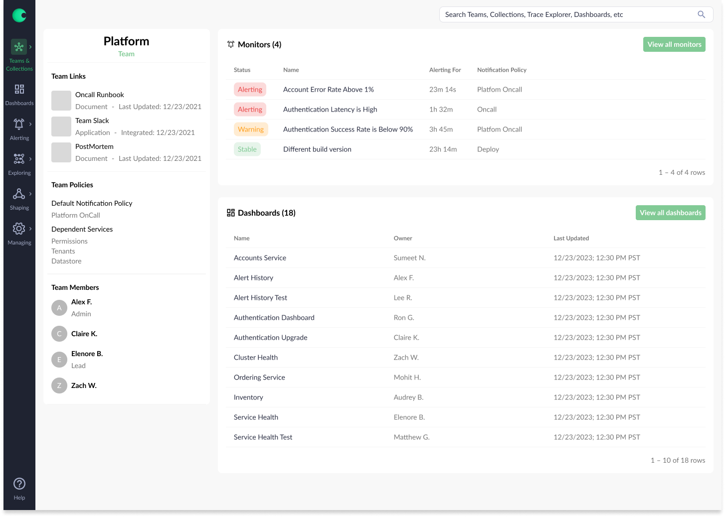
Final Design
After multiple iterations and rounds of testing, we converged on a navigation model centered on familiar patterns and fast access to critical information. We ultimately selected a left-hand navigation structure because it aligned with user expectations and reduced anxiety during transition—especially when users initially feared that changes in layout meant lost data.
To complement this structure, we introduced a prominent global search experience that allowed users to access any resource from anywhere in the product. Adding keyboard shortcuts further improved speed and efficiency for power users and was consistently highlighted as a valuable enhancement during testing.
This combination of structured navigation and universal search significantly improved discoverability and workflow efficiency. Users were able to locate relevant artifacts in an average of two clicks, compared to 4.5 clicks previously. In addition, triage workflows became substantially faster, with users reporting nearly a 50% reduction in time spent investigating issues due to reduced navigation overhead and more centralized access to key information.
Tradeoffs
While the project was ultimately successful, we made several intentional tradeoffs driven by timeline constraints, engineering capacity, and evolving product priorities.
Data visualization strategy:
Chronosphere initially relied on embedded Grafana dashboards, which provided functionality but created a fragmented experience. When Grafana introduced licensing changes, the team made a strategic decision to build an in-house visualization library to better integrate data experiences across the product. Early in the project, we collaborated closely with a visualization team and even structured parts of the new information model around these evolving components. However, as scope and engineering effort became clearer, it became evident that the visualization library required more investment than initially anticipated. As a result, we deprioritized aspects of this work, which influenced some of the final design decisions.
Personal homepage concept:
We explored a personalized homepage experience that would allow users to store dashboards and monitors for quick access. While valuable in concept, the underlying permissions model introduced significant complexity, particularly around sharing and access control. Given the additional scope required to do this correctly, we deferred personalization in favor of improving baseline discoverability.
Design system maturity:
In parallel with this project, I was also responsible for evolving the Chronosphere design system. Because the information model work was a higher-priority product initiative, many components were designed before the system was fully established. As a result, some of the final interfaces reflect earlier patterns that we later revisited once the design system matured.
These tradeoffs helped the team stay focused on delivering the core information model while surfacing important areas of investment for future iteration.
Next Steps
While the current information model significantly improved discoverability and triage efficiency, there are several opportunities to further evolve the experience as customer environments and usage patterns continue to scale.
AI-assisted information modeling:
Today, teams and collections rely on manual upkeep to stay accurate and useful. A key opportunity is to introduce AI-driven assistance to help maintain and improve these structures over time. For example, AI could surface suggestions for related entities based on shared metrics, usage patterns, or similar user workflows, prompting users to add or review relevant artifacts they might otherwise miss.Cross-collection references:
Currently, monitors and dashboards can only belong to a single collection. However, users often need visibility into related services owned by other teams in order to understand upstream and downstream impact. Enabling entities to be referenced across collections would improve system-wide visibility and help users more effectively assess service health in context.Personalized workspaces:
Many users create temporary dashboards and monitors for debugging or testing purposes, but today these must live within shared team collections, which can introduce clutter. Introducing personal spaces for experimentation and bookmarking would allow users to organize their own work without impacting shared team views. This would improve both individual productivity and overall clarity of team-owned collections.
Takeaways
Design for a spectrum of users, not a single persona.
Chronosphere served customers ranging from early-stage startups to large enterprise engineering organizations. This required balancing solutions that worked across varying levels of scale, complexity, and maturity rather than optimizing for the loudest or most advanced user group.Stay curious and embrace technical discomfort.
I joined Chronosphere with limited prior experience in observability systems, which initially required a steep learning curve. Rather than treating this as a limitation, I leaned into it—asking foundational questions, challenging assumptions, and using early uncertainty as a way to better understand the full system before committing to design decisions.Ground design decisions in understanding, not assumptions.
Because many collaborators were deeply technical, it was easy for solutions to feel “already solved.” I learned to slow down, ask clarifying questions, and validate the underlying problem before moving into execution. This helped ensure we were solving the right problem, not just accepting the first viable solution.Use roadmaps as guidance, not constraint.
We aligned early on a roadmap informed by customer needs and business priorities, but treated it as an evolving tool rather than a fixed plan. Regular reevaluation with cross-functional partners allowed us to make intentional tradeoffs and adjust sequencing as new information emerged.Design is most effective when it operates between perspectives.
One of the biggest learnings from this project was how critical it is to translate between users, engineering constraints, and business goals. The strongest outcomes came from situations where design acted as a connector—helping align different viewpoints into a single, coherent solution.